Microsoft 365 admin center
Turning a cluttered IT admin deployment directory into a 90% traffic gain
Project overview
At Microsoft, I worked with a team developed deployment guides for Microsoft products, helping customers configure and deploy both new and existing solutions. When COVID-19 nearly doubled the volume of guides, the existing page couldn't keep up, and a redesign became necessary.
Impact
The redesign drove a 90% increase in page traffic, with 81% of users now accessing the page on a weekly basis. Beyond the numbers, the new layout was designed to scale, and flexible enough to support future growth in deployment guides without needing another overhaul.
Timeline
12 months
Role
Lead designer, researcher
Team
Product managers, a team of developers and me
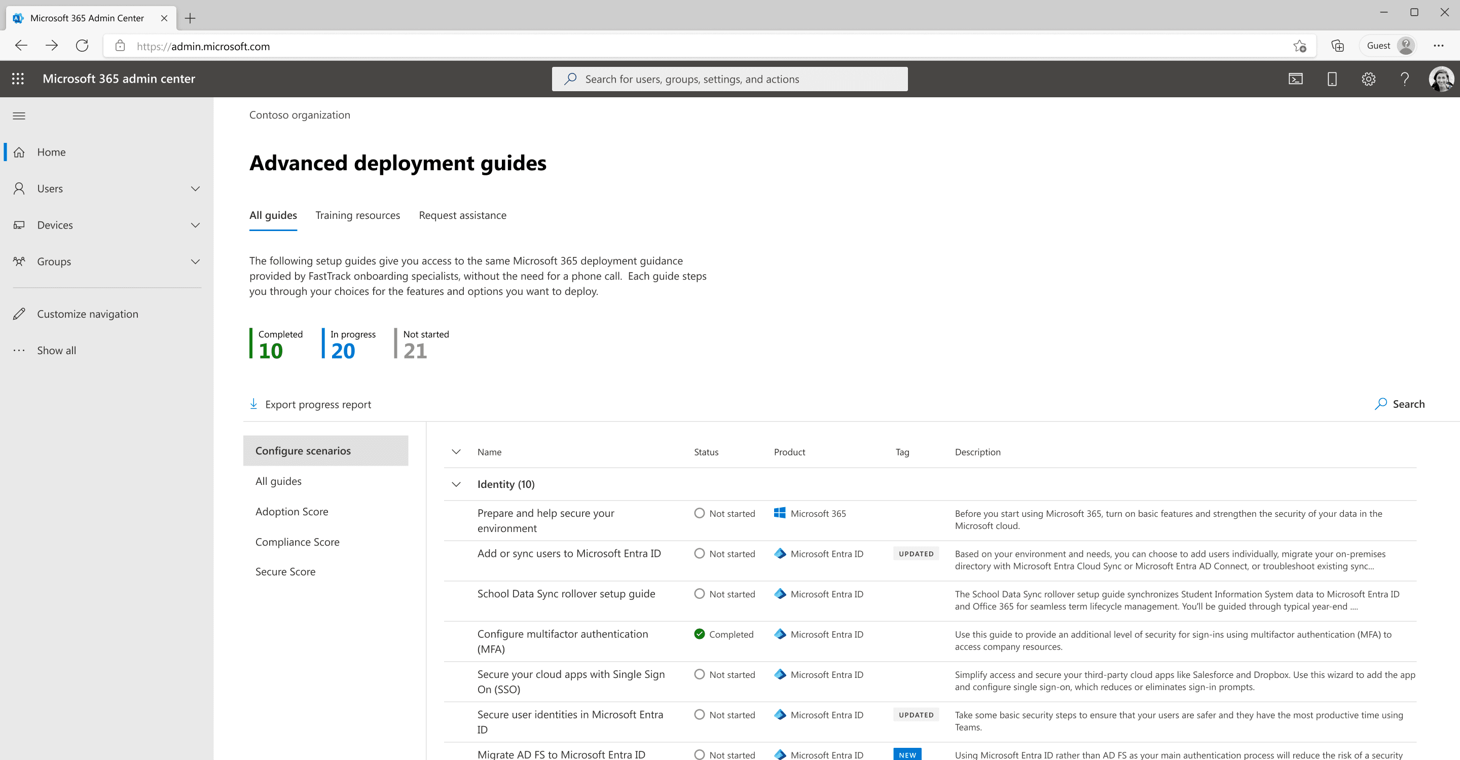
Before

Pain points
1
This page is very long, this is only about half of the page. The amount of content is hard to scan without feeling overwhelmed. Most information are the same on each page.
2
Similar to page one, it's a long page. For unexperienced users, sometimes search and simple filter feel not enough way finding to the resources.
After
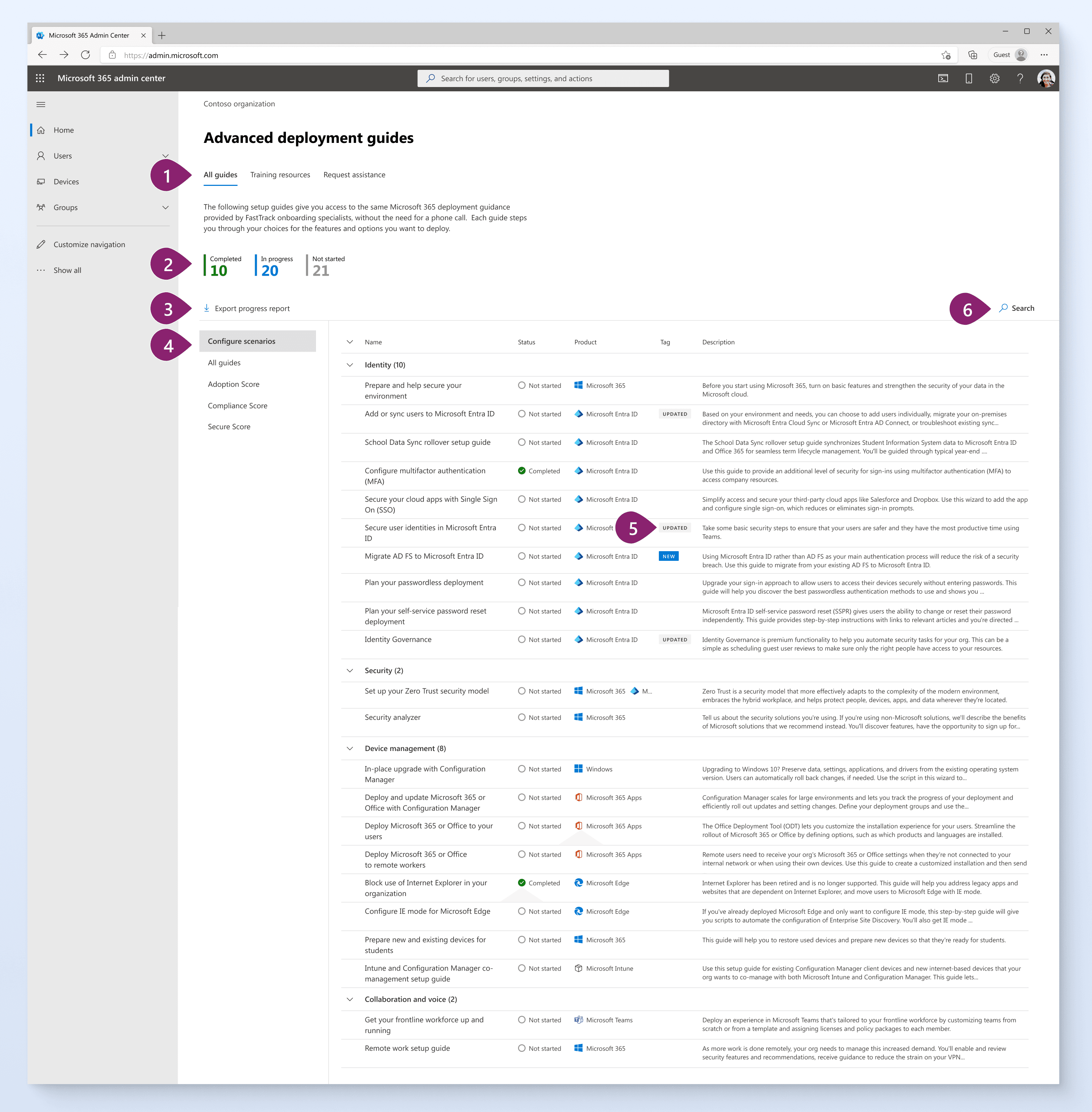
Improvements
1
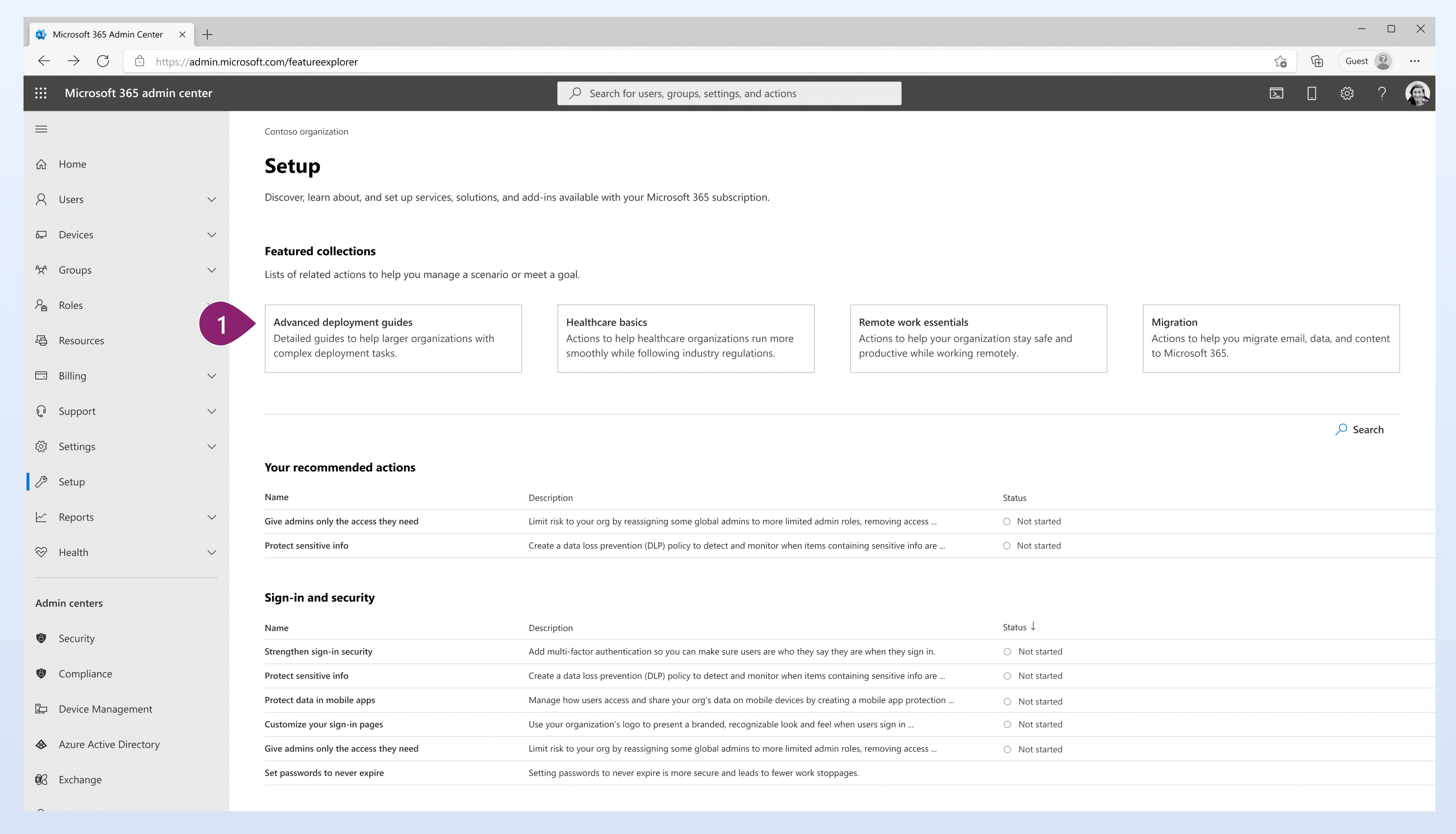
I consolidated all the deployment guides to this single, easy to navigate one page layout to improve discoverability and minimize the learning curve for users.
2
Number counts provide admins with a quick overview of the guides they’ve used.
3
Admins can now export their progress.
4
A side navigation to divide the large body of content.
5
Updated and New labels allow the admin to scan better.
6
Search function above the list to allow admins to find the resources quickly.
User research
Testing
I created three design directions based on existing layouts and other researches:
A
Similar layout to existing design, with filters at the top
B
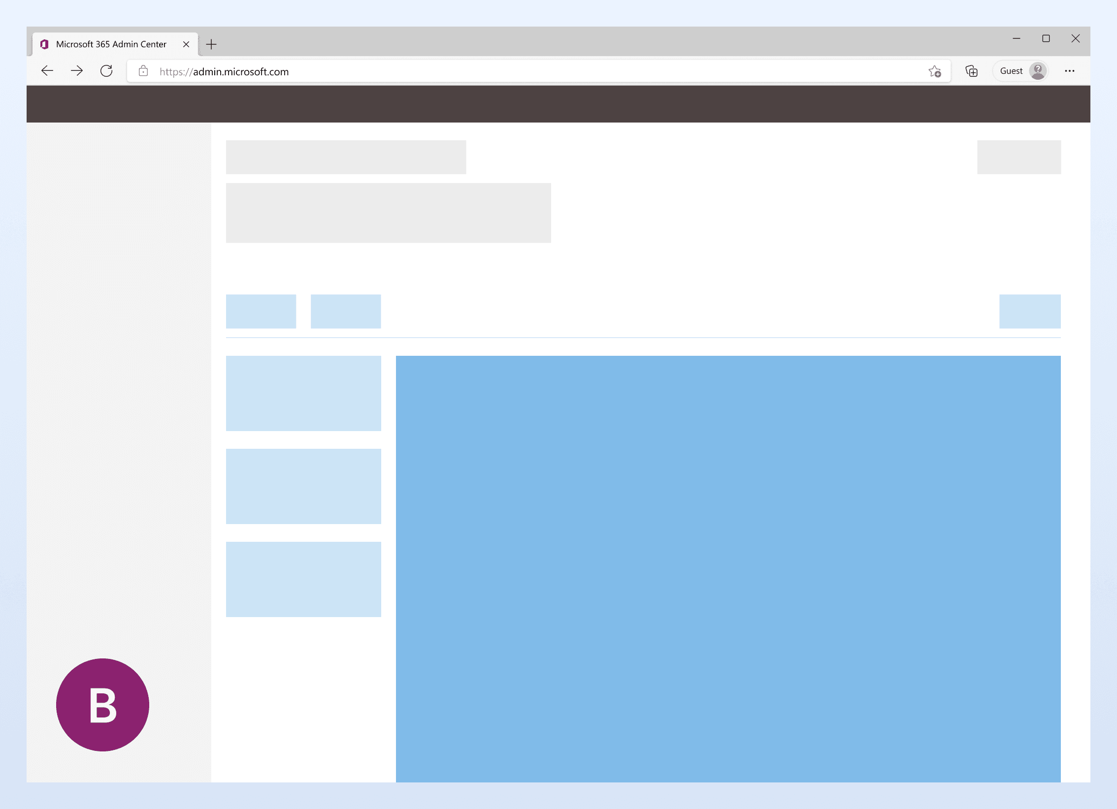
Layout with a side navigation system on the left, with a lighter blue color.
C
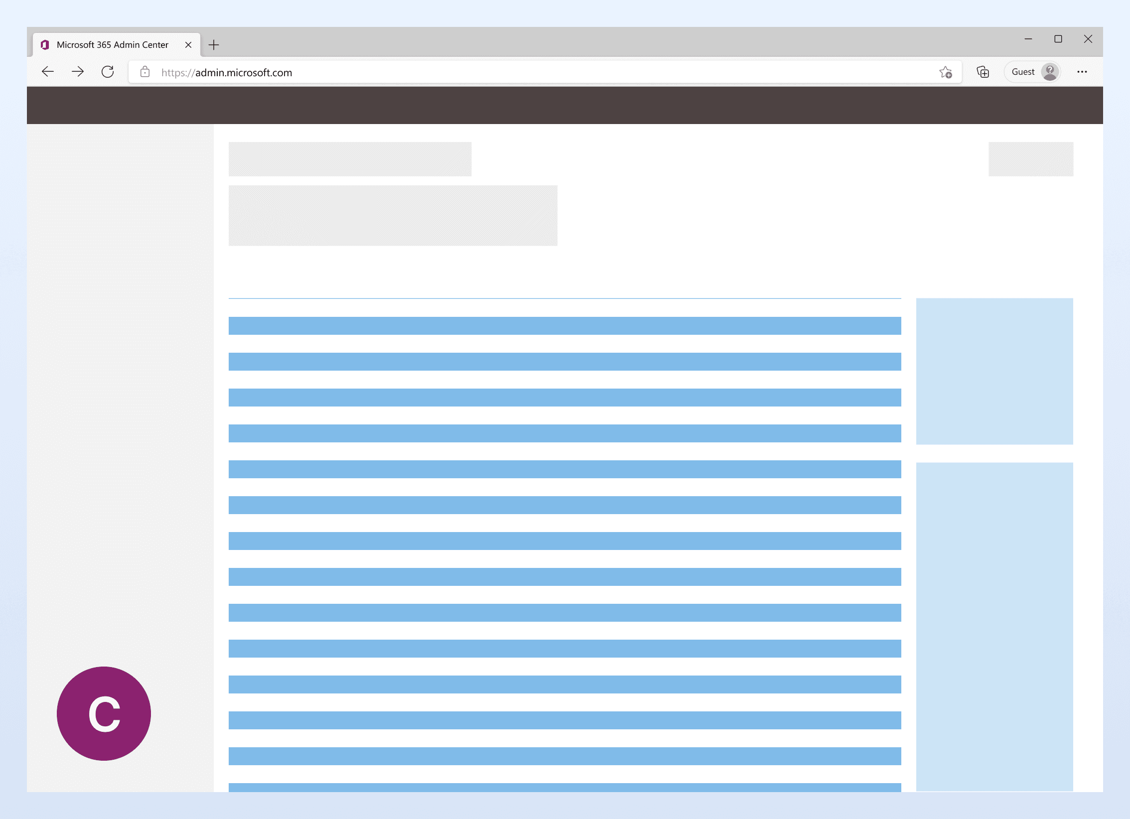
Layout with a pane on the right side, with a lighter blue color.
Findings
I interviewed 12 IT admins who have previously used the Microsoft 365 admin center. The primary findings from these interviews are:
Filtering
All IT admins find the two pages design overwhelming. They all would like to see some level of filtering to help them narrow down.
Side navigation
84% admins find the version with side nav helps them to find the resources easier.
Export progress
Half of the admins expressed exporting task progress could be helpful for their current role.
New entry point
The existing entry point is a small link on the home page, has low discoverability. To ensure that the new page reaches out to more admins responsible for deployment and setup work, my direct team collaborated with the setup page team. We identified a new entry point for the advanced deployment guide page.
1
New entry point with significantly increased visibility, as it is the page that admins access during the setup and deployment process.
WCAG / Reflow
To ensure compatibility across various screen sizes, I’ve also incorporated new reflow specifications.

Column filter
Additionally, I created a column filter to allow admins to focus on the content they would like to focus on.

Results
90%
Traffic increase
81%
Weekly active users increase
Flexible
Layout that supports more content
Retrospective
The level of support provided by my design colleagues and product team is extensive, particularly from my colleague Julie and manager Aaron. I have gained valuable insights and knowledge throughout this project.
If I had more time, I would like to create more variations for the in-page side navigation by categories and test them with more users.